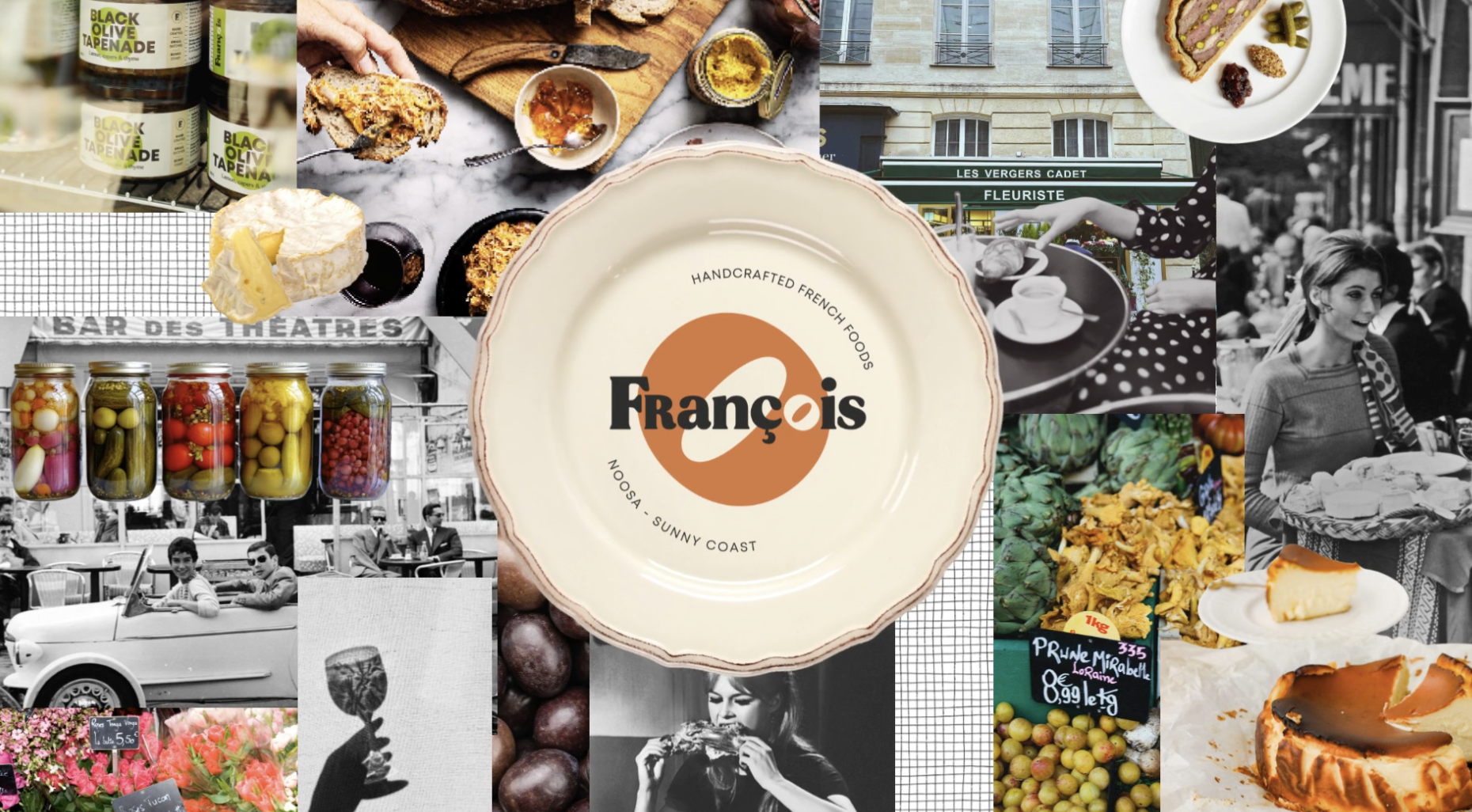
François

Scope
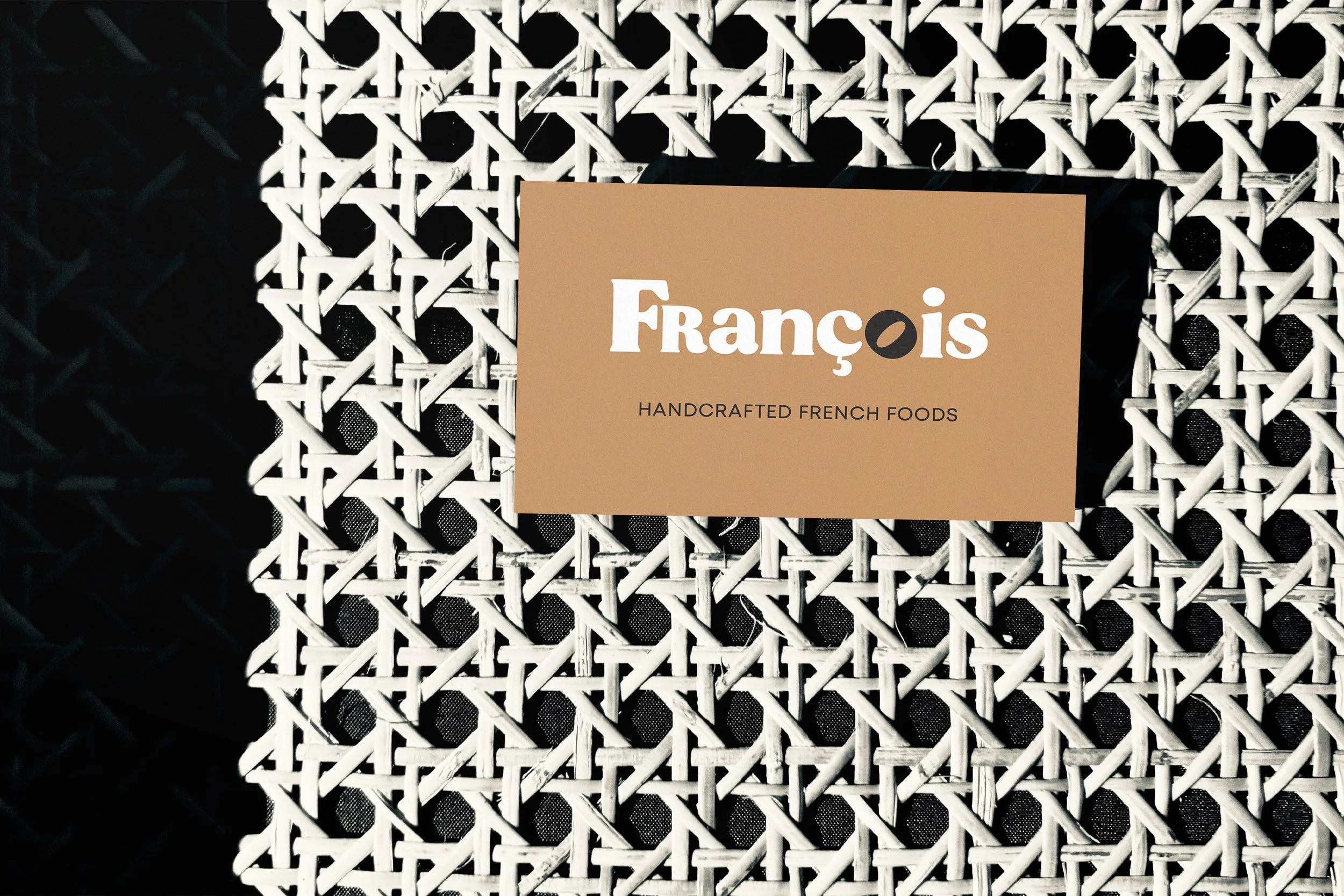
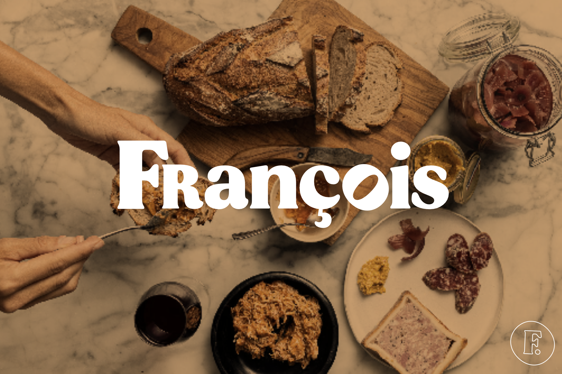
Brand Identity
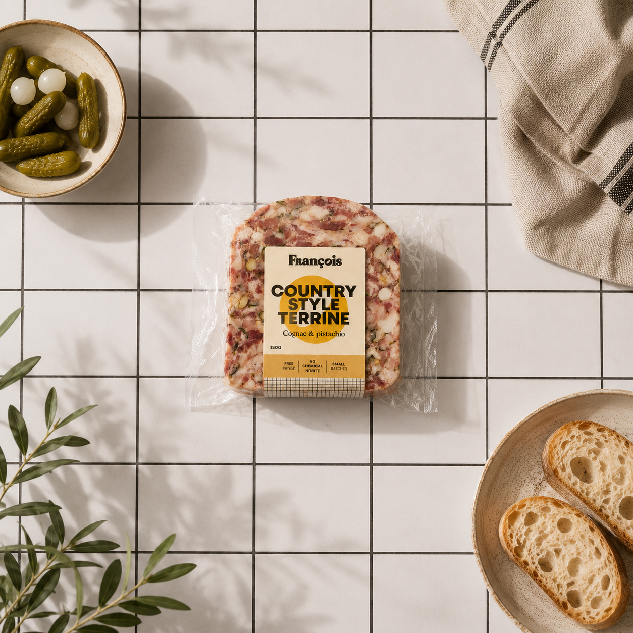
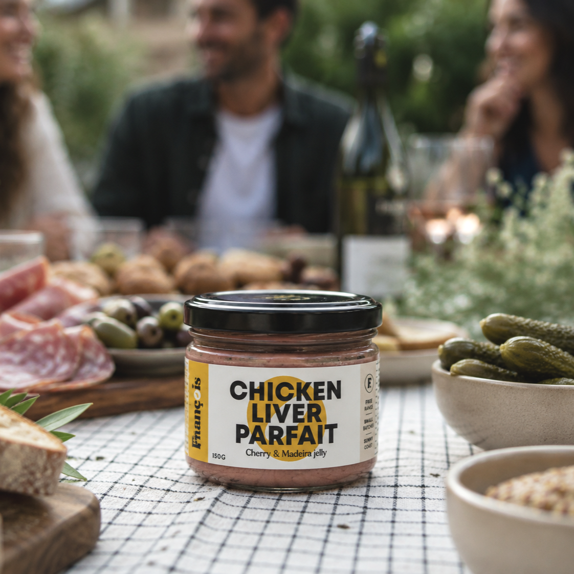
Packaging
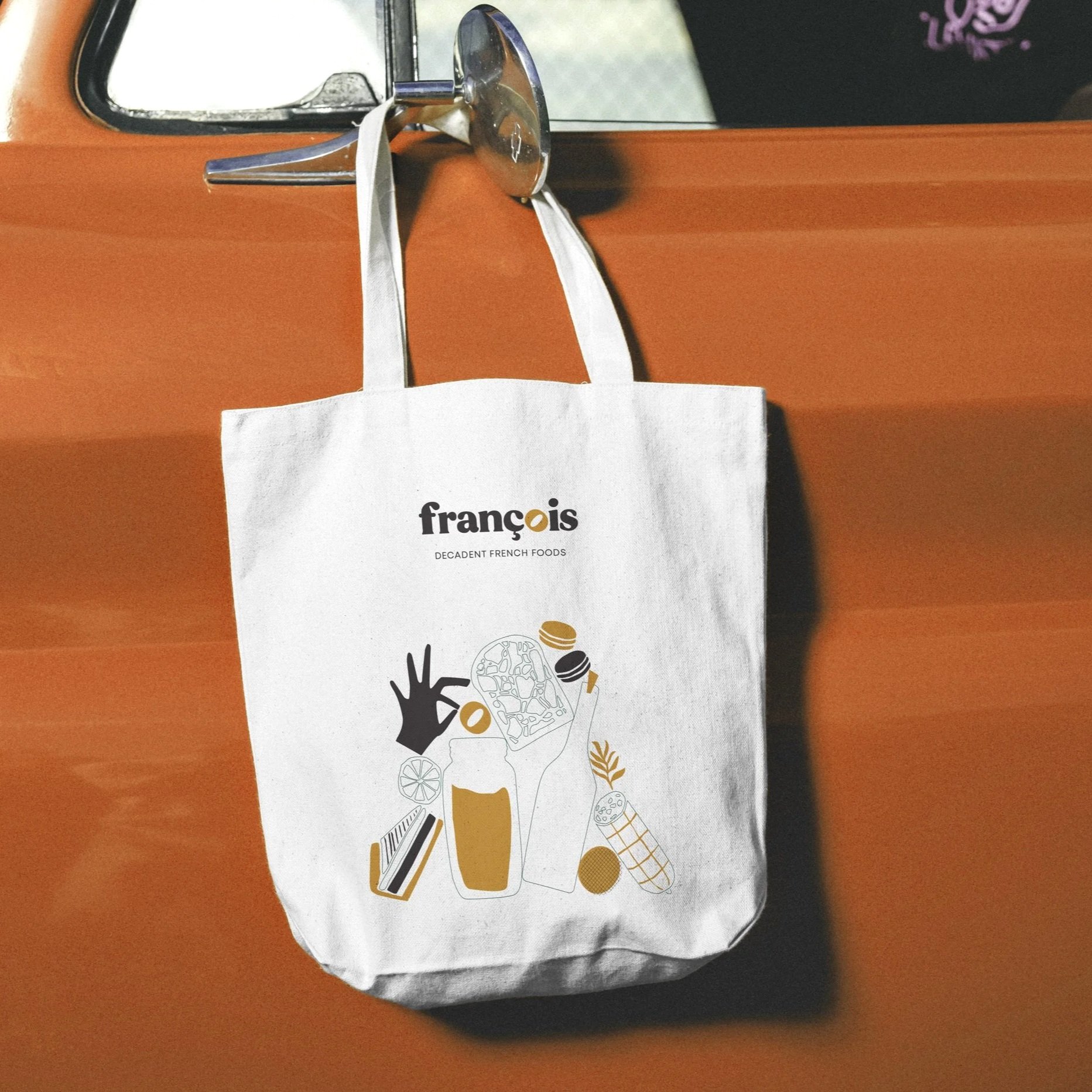
Print Collateral
Illustration
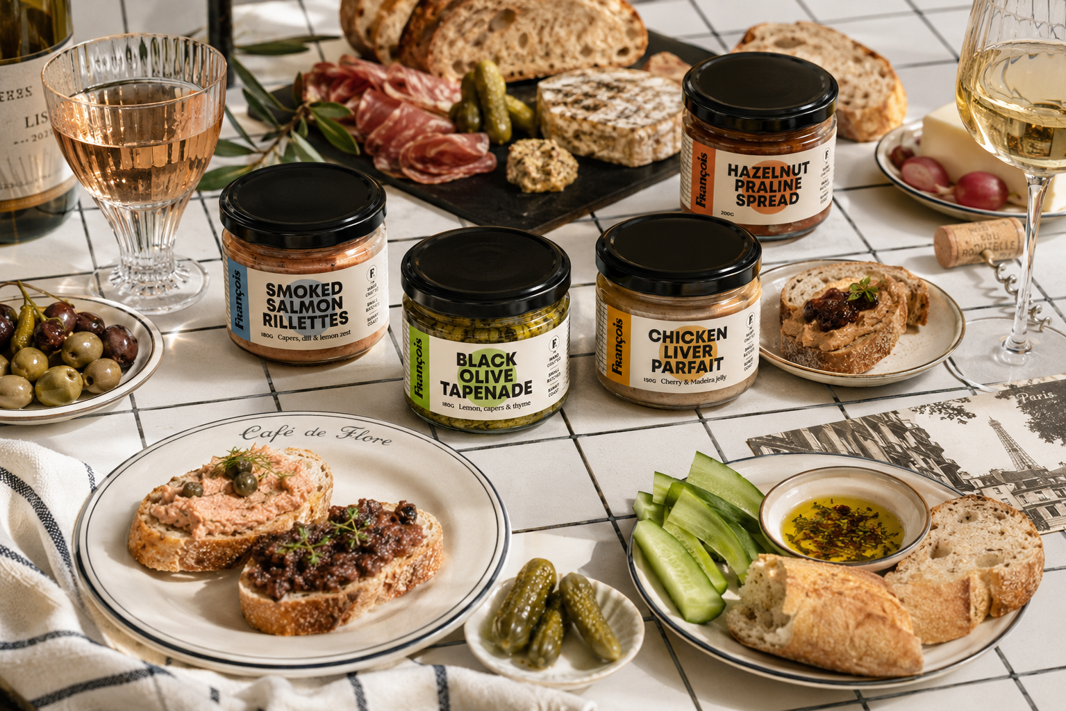
A delicatessen concept built around classic recipes: duck confit, rillettes, parfait, Basque cheescake... A brand that feels nostalgic yet alive, made to be discovered, tasted & remembered.
Concept
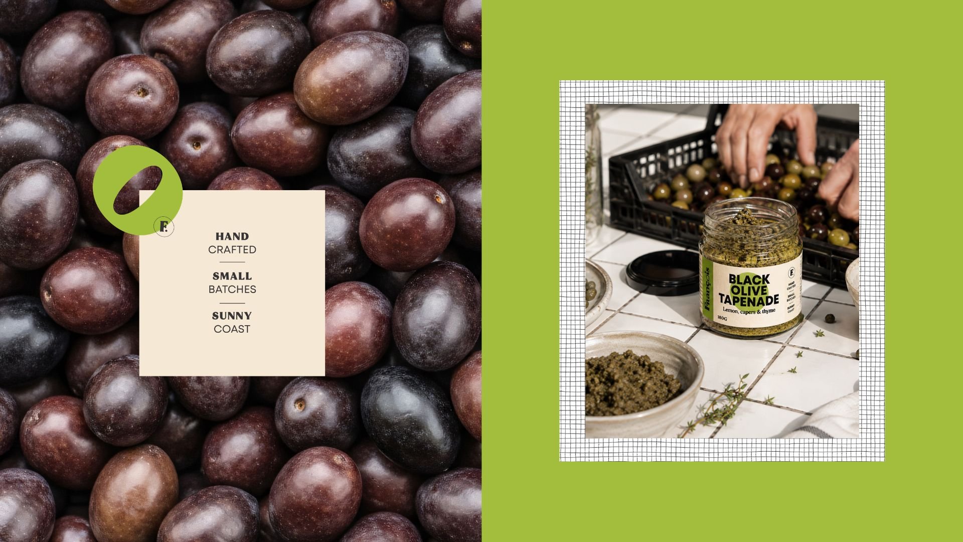
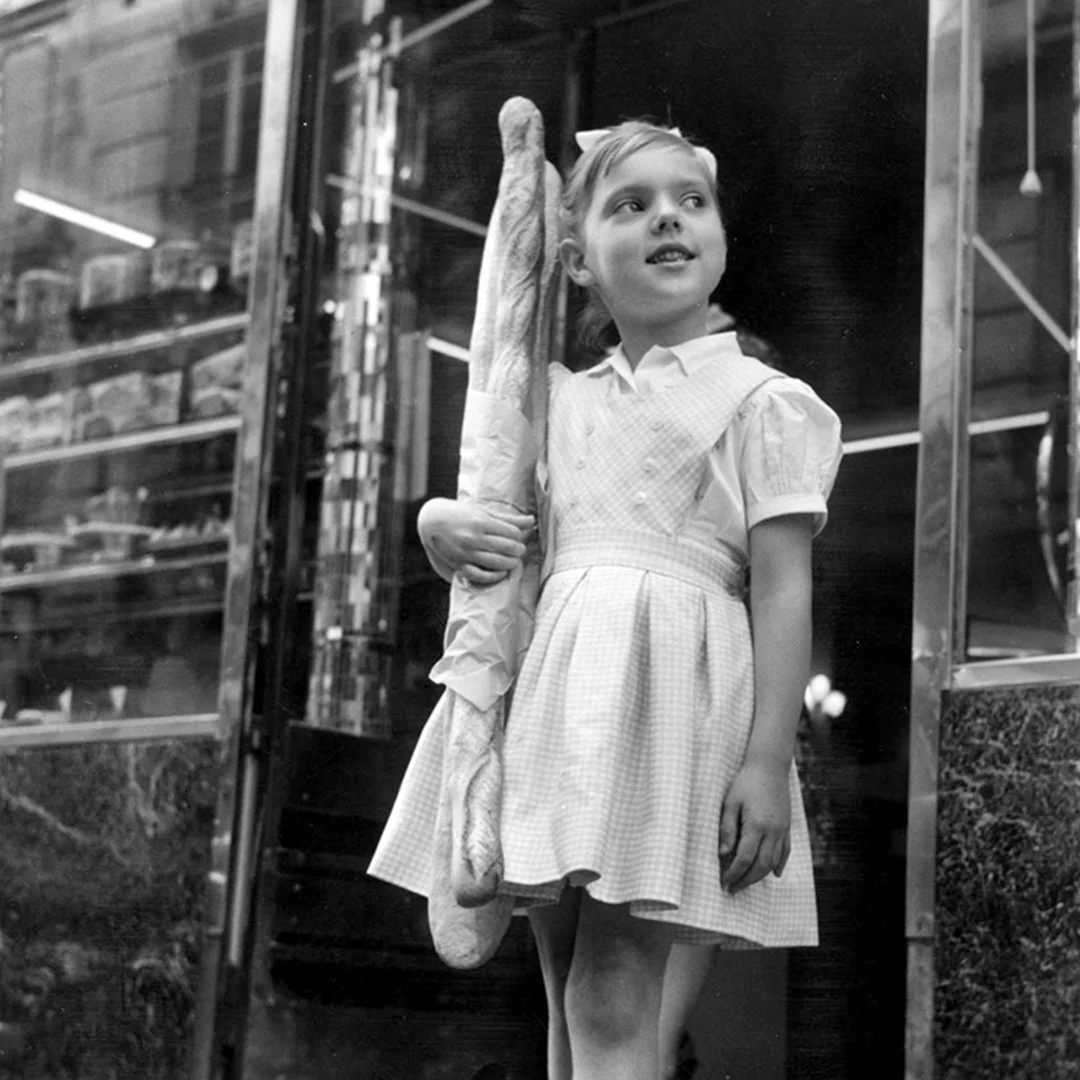
The name François meaning “Frenchman” draws on a familiar idea of the French: timeless, recognisable, and full of character. Rooted in culinary heritage, the concept reinterprets this spirit for local markets on the Sunshine Coast.

A series of hand-drawn, simplified forms… Reference the products themselves, but in a more expressive, poetic way.
The compositions feel abundant and slightly imperfect, echoing the richness of food culture
& market life.
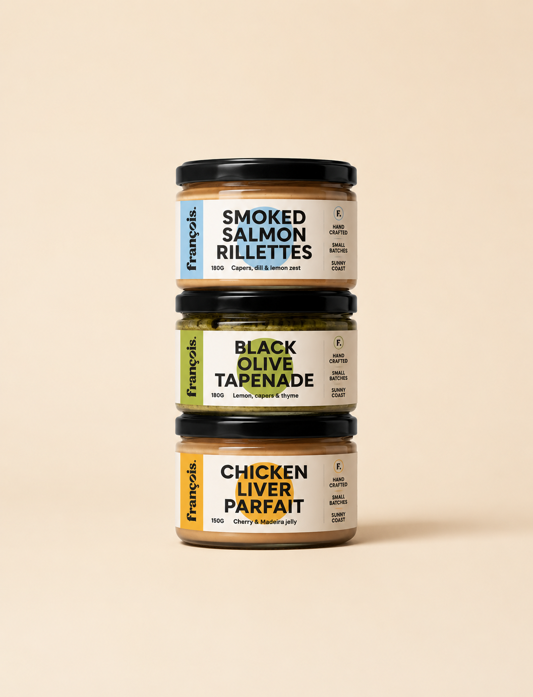
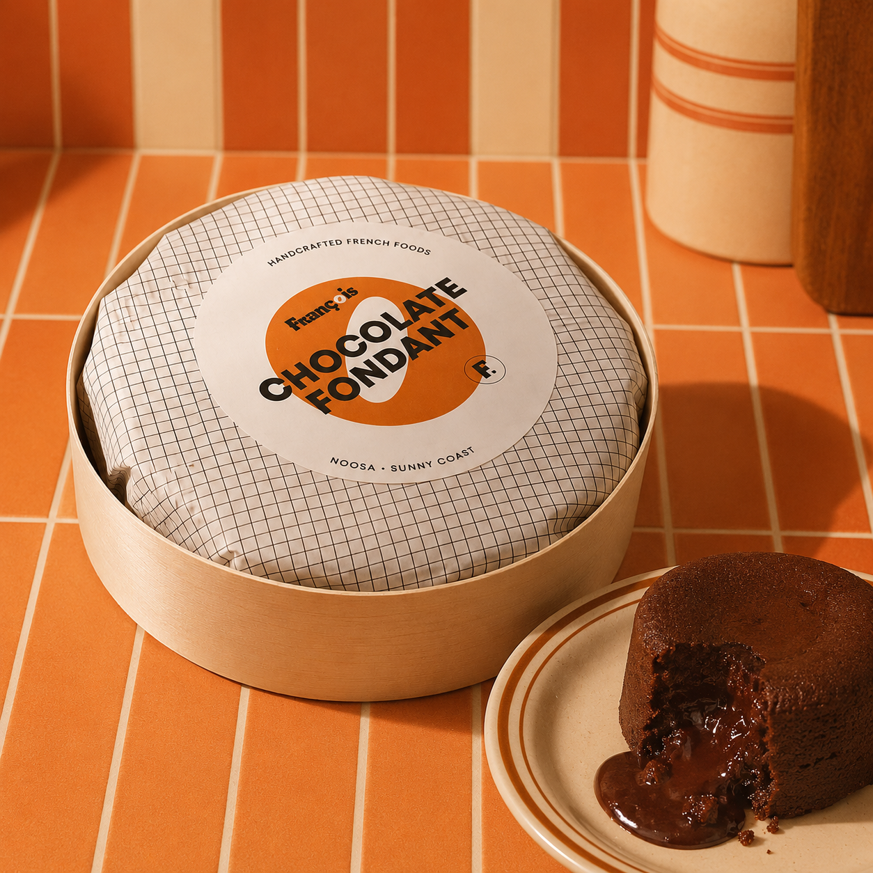
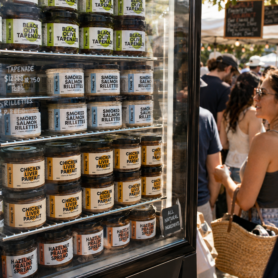
Packaging was designed to feel bold, recognisable. Glass jars, labels, and seals use strong typographic layouts paired with vibrant colour blocking, ensuring visibility in busy market environments while maintaining a cohesive identity.
François is designed to feel familiar, generous and full of character. Rooted in tradition with a playful edge. Good food, shared moments and a sense of abundance.